Jack Bronx©

Motivaete
Personal Development & Coach Website. A calm space, designed with intention
Motivaete — Personal Development & Coaching Website
Motivæte is the practice of a certified Development Coach and Behavioural Change Therapist. The goal was a multi-page site that reflects her calm, evidence-based approach and guides visitors — often arriving at a vulnerable moment — toward booking a discovery call without pressure.
Role and scope
- UI/UX design
- Brand Direction
- Interactive Asset Engineering
- Webflow Development
Objectives
- Translate a deeply personal, transformational coaching philosophy into a high-end, premium B2B digital asset.
- Build a seamless, immersive single-scroll layout that establishes deep emotional resonance and authority instantly.
- Showcase a diverse mix of visual content, text blocks, and structured FAQs without cluttering the minimalist aesthetic.
- Drive highly qualified intake applications through a strategic, low-friction conversion pipeline.
Audience
Adults navigating life transitions, emotional overwhelm, chronic pain, or a quiet sense of disconnect — people who have likely tried other approaches and are now looking for something that actually fits. They arrive cautiously and need to feel understood before they take any action.
Approach
The site is built around emotional safety first and information second. The homepage orients the visitor, the About page builds deep personal trust through Mehmoona's own story, and the Services page gives enough detail to be helpful without overwhelming. Every page ends with the same low-pressure prompt: a free discovery call, not a purchase.
Design highlights
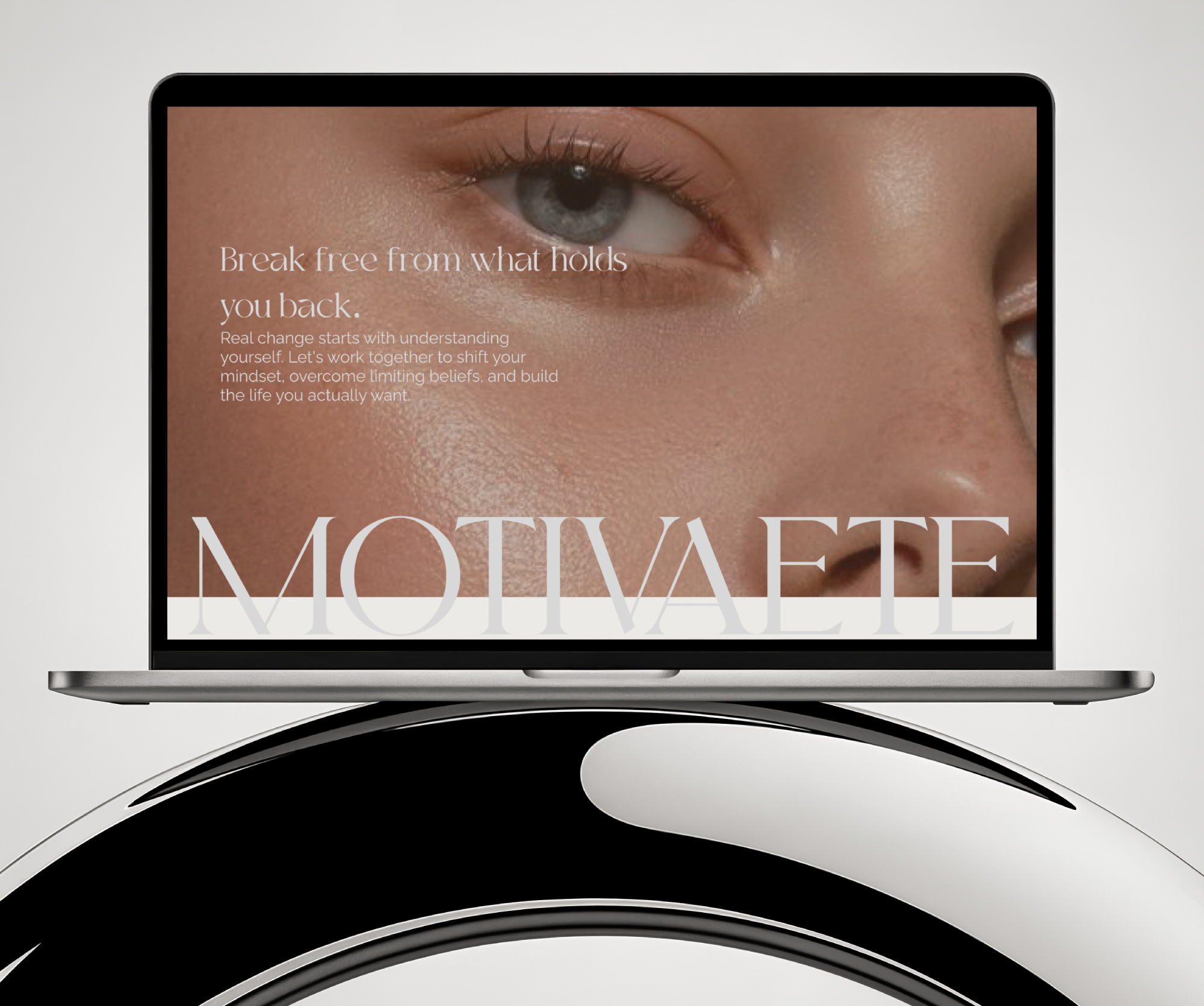
- Homepage: quiet hero with the brand name and a single direct CTA. Navigation is clean — About, Services, Blog, and Book a Call. No clutter, no competing messages.
- About page: structured in four acts — approach, story, transformation, and commitment. Long-form but paced beautifully, with section numbers anchoring the scroll. Personal and authoritative in equal measure.
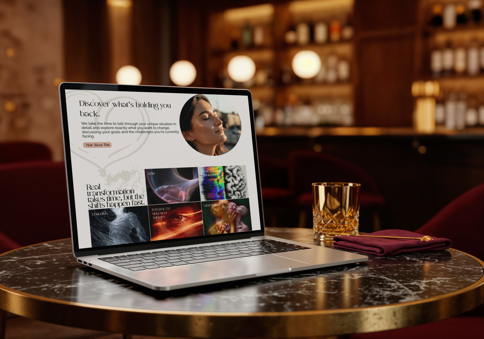
- Services page: five modalities presented as individual numbered sections — Personal Development Coaching, NLP, IEMT, Reiki, and OldPain2Go®. Each follows a consistent pattern: best for, overview, key benefits, and how it works. Scannable for someone comparing options, readable for someone who needs reassurance.
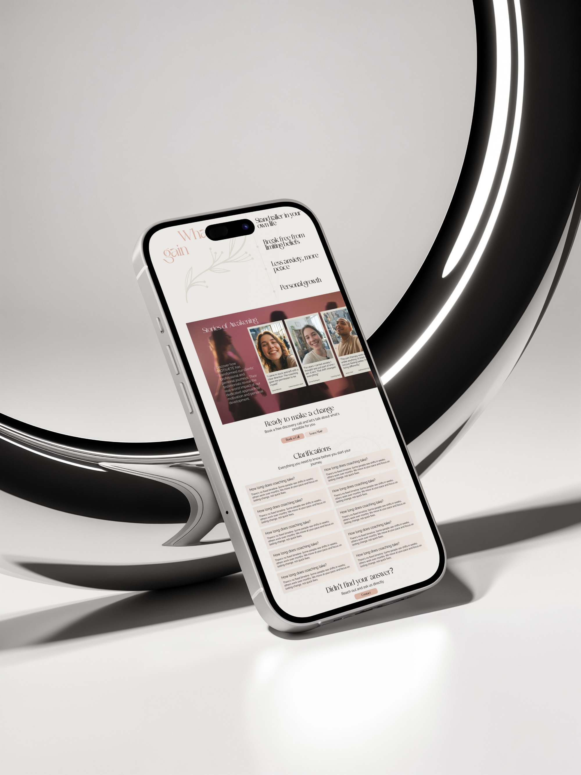
- Contact prompt: appears at the base of every page with the same calm message — take the first step, gently.
Visual language
- Type: the Æ ligature in the wordmark signals something considered and unconventional — the rest of the typography follows suit. Calm, editorial, with generous white space.
- Color: restrained and warm. No loud accent colors. The palette feels like the coaching itself — quiet confidence, not performance.
- Imagery: editorial photography that centers real people in genuine, grounded moments. Nothing aspirational or stock-feeling.
Interactions
Understated throughout. Smooth page transitions, gentle fades on scroll, and hover states that acknowledge without animating. The experience mirrors the practice — present, unhurried, and intentional.
Accessibility and performance
- High contrast body text, generous sizing, and clear focus states for keyboard navigation.
- Images optimized and lazy-loaded. Webflow's clean output ensures consistent performance across devices and connection speeds.
The site gave the coach a credible, emotionally resonant online presence that attracts the right clients and converts hesitant visitors into booked conversations.
"Professional, clear, and exactly what a billing company should look like online. The site does the selling before the call even happens."
Services delivered
Website Design, UI/UX Design, Editorial Art Direction, Webflow Development, Micro-Interaction Engineering
Tools
Figma for high-fidelity UI layout and typography system prototyping, Webflow for clean frontend development and responsive class architecture.